Your home. Your haven.
Colour. It’s about so much more than a pillow here, or a throw there, a rug in a certain room or your bedroom accessories. It’s about creating your home; it’s the ultimate expression of who you are and how you want to live.
But where to start?
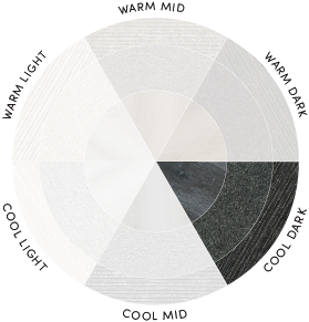
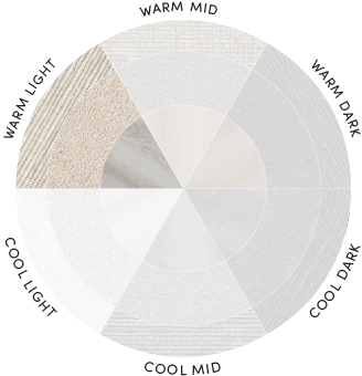
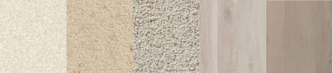
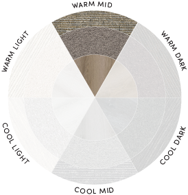
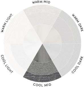
With the plethora of choice now available, we thought we’d make the journey a little easier for you by dividing our flooring and window furnishing colours into light, mid, and dark palettes, and then focusing on warm or cool undertones.
You’ll find an exploration of these below, along with expert-level advice on how to best accentuate and accessorize color, and what moods and emotions certain themes evoke.
After all, how your home feels is just as important as how it looks - and choosing color themes is the first critical step in creating what you want.
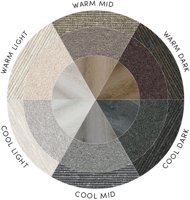
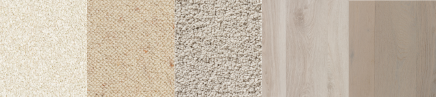
warm / light
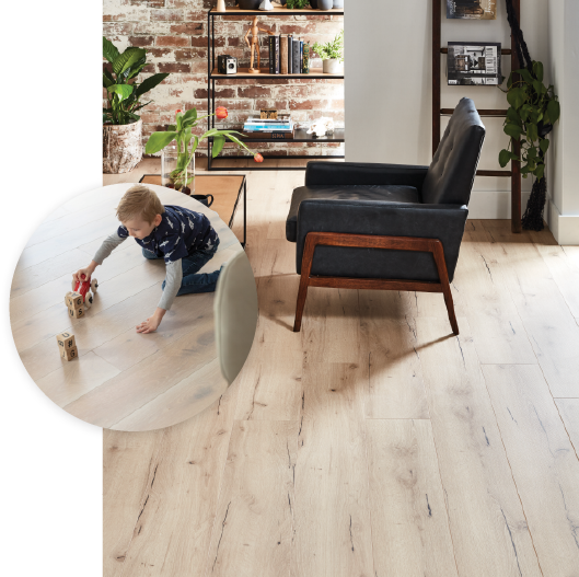
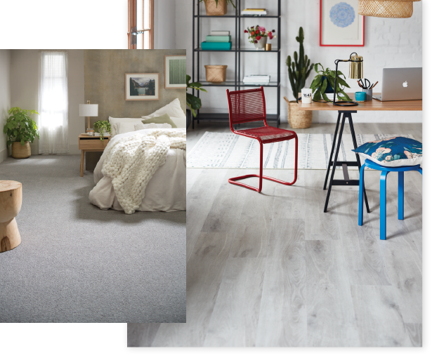
Softness, Radiance. Light-filled and abundant, yet still cozy and ultimately welcoming. If you want your home to feel fresh and cheerful, try a warm/light color theme.
To create this inviting palette, use flooring colors in the beige family, including ivories, creams, and whitewashes.
Then, complement these soft hues with a splash of dazzling color. Sunshine yellow, citrus orange, or azure blue work well here, or if you’d like something more modern and bold, try rose gold, metallic or even a dash of hot pink.
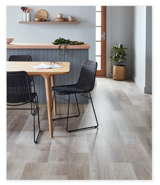
cool / light
You’ll create a relaxing and refreshing feel in your home that oozes sophistication when you choose a cool/light theme.
Flooring in this palette is all about soothing, light grays, ranging from creamy abalone, to stone and steel tones.
To finish your cool/light look, match your grays with midnight blue, hunter green or soothing purples. Vibrant melon decor also perfectly complements this palette.
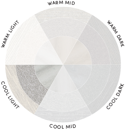
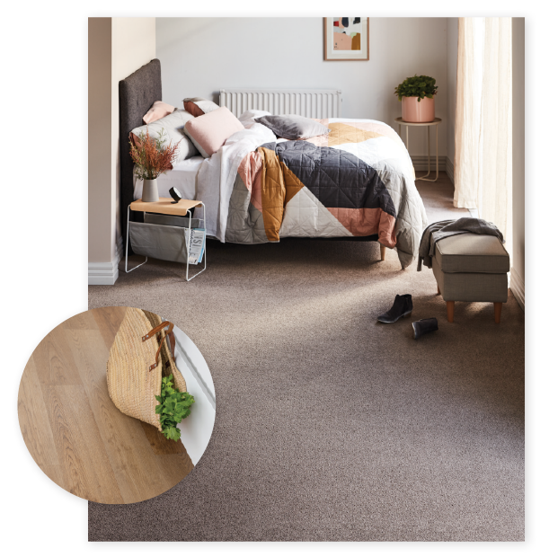
warm / mid
Care for something a little more striking? Choose a warm/mid theme to create intrigue in your home, while maintaining an ultra-modern and stylish approach.
Colours in the warm/mid family are, in a word, delicious. Add delight with sweet cinnamon, go bold with coffee colours, or enrich with mid-browns. Using warm/mid intermittently throughout your home can also help create distinct zones.
To complete the look, contrast these alluring hues with cedar furniture, golden bronze trimmings and a touch of deep, dusty pink or midnight blue.
cool / mid
Did someone say sleek? Your home will radiate style with a cool/mid theme. With these colours, you can create stark contrasts while still maintaining a fresh and cosy feel.
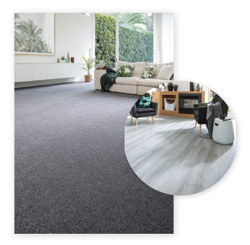
Medium to darker greys dominate the cool/mid family. Try medium greys for a refreshing, contemporary look, or be bold and say something with darker, more charcoal-inspired colours.
Our cool/mid greys work best with rich creams, anything in the copper family, or for something a bit more exciting, try forest green!
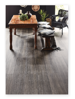
warm / dark
For a look that’s sweet like chocolate, yet also a bit daring and different, choose a warm/dark theme. You’ll be able to use a diverse array of colours with this theme, making your home really pop.
From eye-catching tawny browns, to darker shades of caramel and cherry brown or if you’re feeling courageous, rich chocolate, flooring in the warm/dark family is designed to inspire.
You’ll be able to get creative with your colours with this theme, choosing anything from mustard, to candy pink or steel blue.
cool / dark
Bold, rich and striking is what a neutral/dark theme is all about. Choose between midnight black, dark cherry brown and rich chocolate when you’re creating your home.